Friday, March 11, 2011, 12:24 AM - Web
I finally solved one of the issues my Pic a Day gallery had with Internet Explorer:For any reason, IE (tryed on IE6, IE7, IE8) is unable to dynamically create a not yet declared variable when you directly affect the result of some function.
Javascript is supposed to automatically create global scope variable if you affect something into an undeclared variable:
foo = 5;
...will instanciate the global "foo" variable if not yet declared.
However, if you assign the result of some functions to an unexisting variable, IE simply fails and stops evaluating the funtion where the issue occurs:
foo = document.getElementById('bar');
Assuming there is a element called 'bar', then this line fails if 'foo' is not yet declared (but this works as expected under Firefox 3.x). Declaring 'foo' before using it solves this Internet Explorer issue:
var foo;
foo = document.getElementById('bar');
| 0 trackbacks
| permalink
| related link
Sunday, November 28, 2010, 09:47 PM - Photo recipes
To create this, it is relatively easy once you found a suitable area to photograph. You need some big straight lines, and preferably some repetitive square patterns, like from windows, tiles,...I used the inner structure of the Arche de la Défense, near Paris:
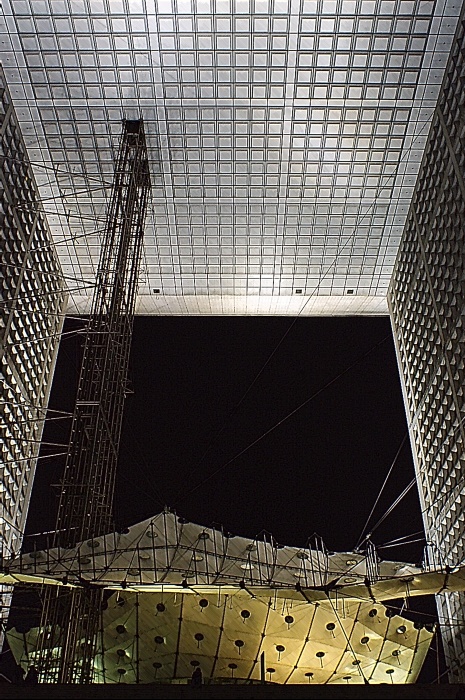
Shooting vertically inside this building provides a nice nearly symmetric pattern, with the roof tiles creating a background pattern:
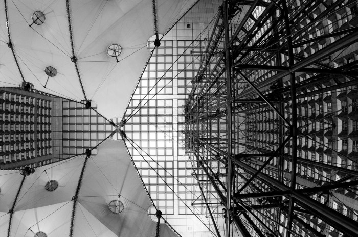
(this one is shot with a fisheye (17mm), thus the distortion)
Find a good position:
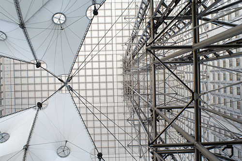
I used my old 21mm Soligor lens, which has the advantage of featuring a nearly non-existent distortion.
Now, let's start the tricks...I placed a graduated sunset filter over the lens, in order to provide an orange gradation. This is a Cokin square filter (inside a P-size holder), which is quite easy to position over the big front element of this lens.
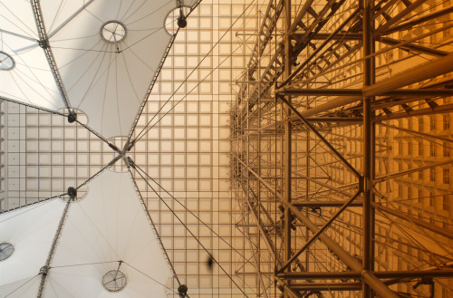
A graduated orange color might seems to be a strange idea, but once you turn the picture into negative, it starts to be quite neat:

White areas turned into black, and orange turned into blue (its complementary color). The pattern from the roof tiles now seems to glow in blue over black.
Tweak curves a bit in order to darken the "wings":

Reduce saturation in order to tune down the blue glow:

Add a final small tweak to curves, and clone out a big dust bunny over the front lens (which happens often when shooting vertically for a long time):

Now just add some borders, and here we are, a blueprint-like done from a real picture, with only minimal post-processing:
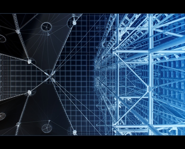
(picture from my 2009 pic a day gallery)
Monday, September 13, 2010, 12:35 AM - Photo recipes
In July Lara Ferroni challenged us to do a photo remake of Matt Armendariz's Ultimate Summer Salad. The key points are:*non-lettuce salade
*landscape composition
*strong rear light
Here is how I created my shot, step by step:
First, set up a placeholder within the plate:
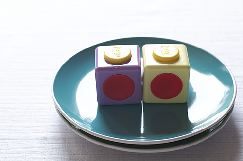
As setting up the shot is usually not done in a snap, using a placeholder allows me to not having to rush while the food is starting to die. When you shoot real food, it's amazing how fast it is decaying.
Light within this set-up is coming from two rear windows, one directly behind the plate and one on the rear-left (as you can guess from the shadows casted by the cubes).
Add a reflector in front of the plate in order to reduce shadows:
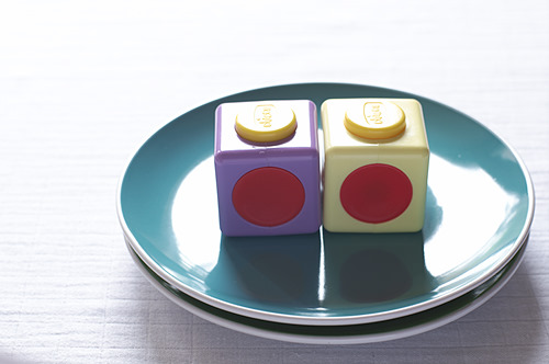
The "reflector" is actually a simple regular white paper sheet.
Another reflector on the front right:
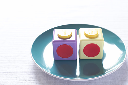
And yet another one on the front left:
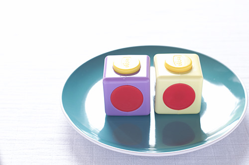
Notice how significant is the change provided by three simple paper sheets acting as reflectors, compared to the first shot.
Set up the props:
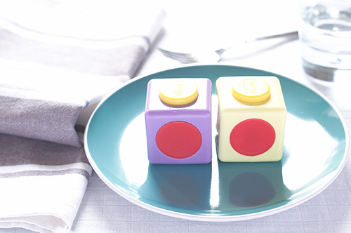
Soften the rear light (ie extend a bit the window's curtain), and adjust exposure:
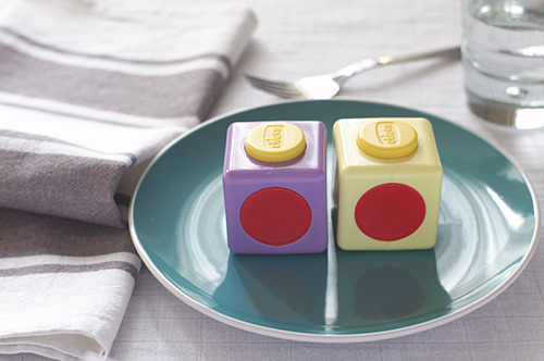
I decided to soften a bit more the rear light and to remove some of the distracting higlights:
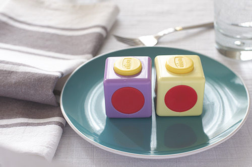
I completely filled the glass which is on the right, and added an other glass on the rear left (outside of the frame) which would cast a slight shadow over the fork, slightly reducing the shiny highlight.
Set up the food within the plate:
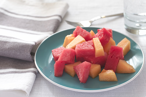
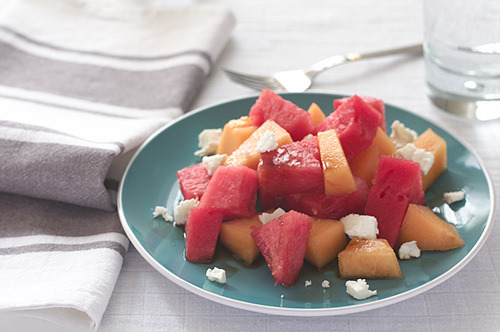
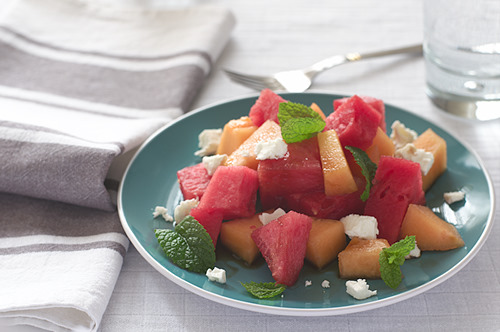
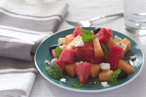
Special care should be took when positioning the leaves, in order to have some of them pointing upward with the light going through them, as this really improves the shot.
The shot looks a bit washed up as it is slightly overexposed (I prefer exposing to the right in order to reduce noise in the shadows)
After some slight adjustments done within the raw converter, here is the result:
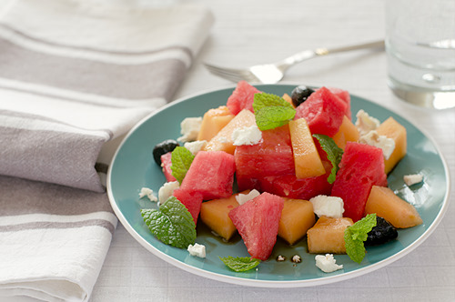
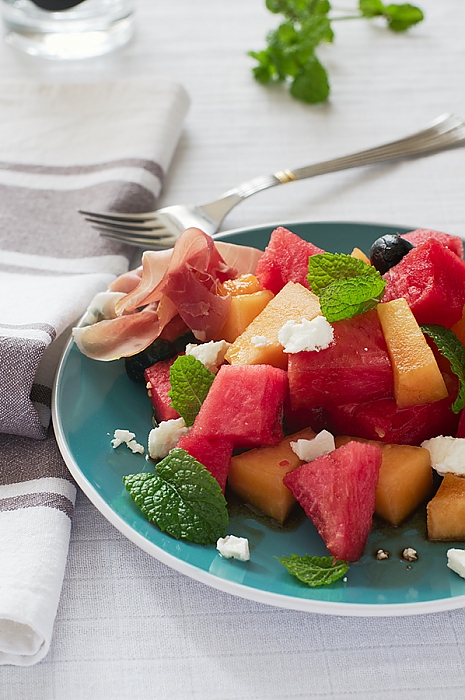
And while everything is set up, don't forgot to shoot a few alternate versions:
Monday, July 12, 2010, 11:09 PM - Lenses
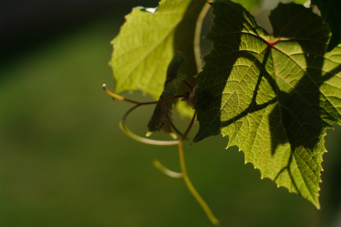
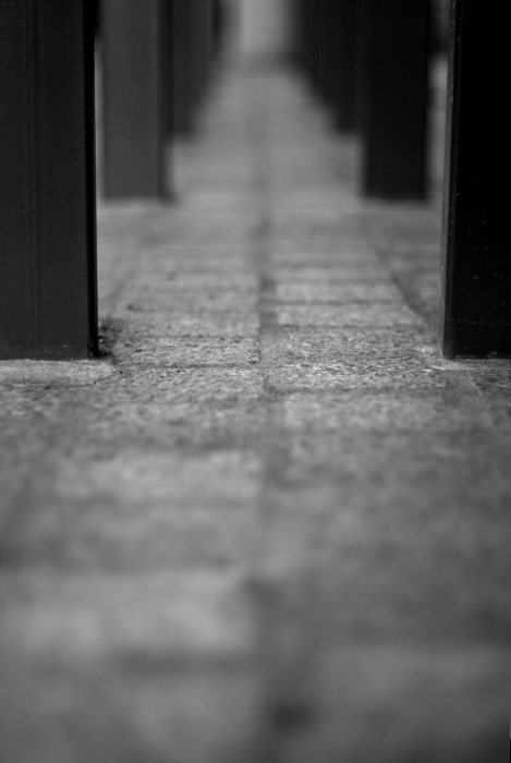
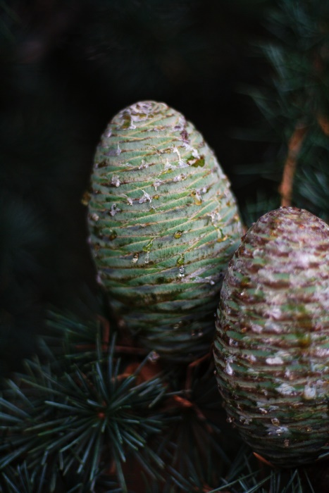
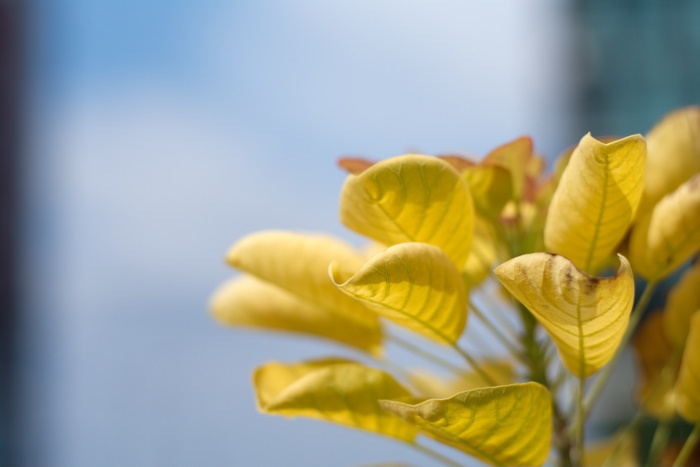
Here are a few shots made with the 50/1.8 m42 planar lens (available under the Zeiss, Rollei, Ifbagon and Voigtlander brandings), from my 2009 pic-a-day gallery: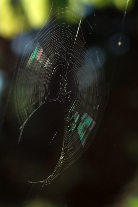
Next

 Calendar


